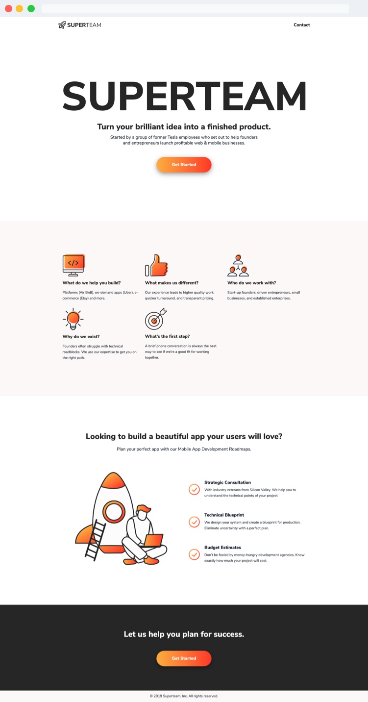
Superteam focuses on bring entrepreneurs' brilliant idea into a finished product. We provide all they need: Access to experienced senior-level talent, tailored information, trusted partners, industry experience, and strategic development processes.
My mission is making the site more apparent and fluid to understand Superteam's service by providing a new landing page.
Time
2019
ROLE
Product Designer
PROJECT BACKGROUND
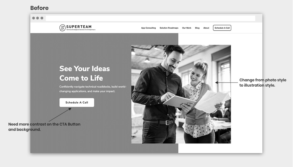
Based on Hotjar Heat Map and User Behavior Record, we found out that our current homepage has a few problems:
Users are easily get lost because of too much information on the page, CTA button doesn't have enough contrast on to convince users, and the website style doesn't match with our branding and services.
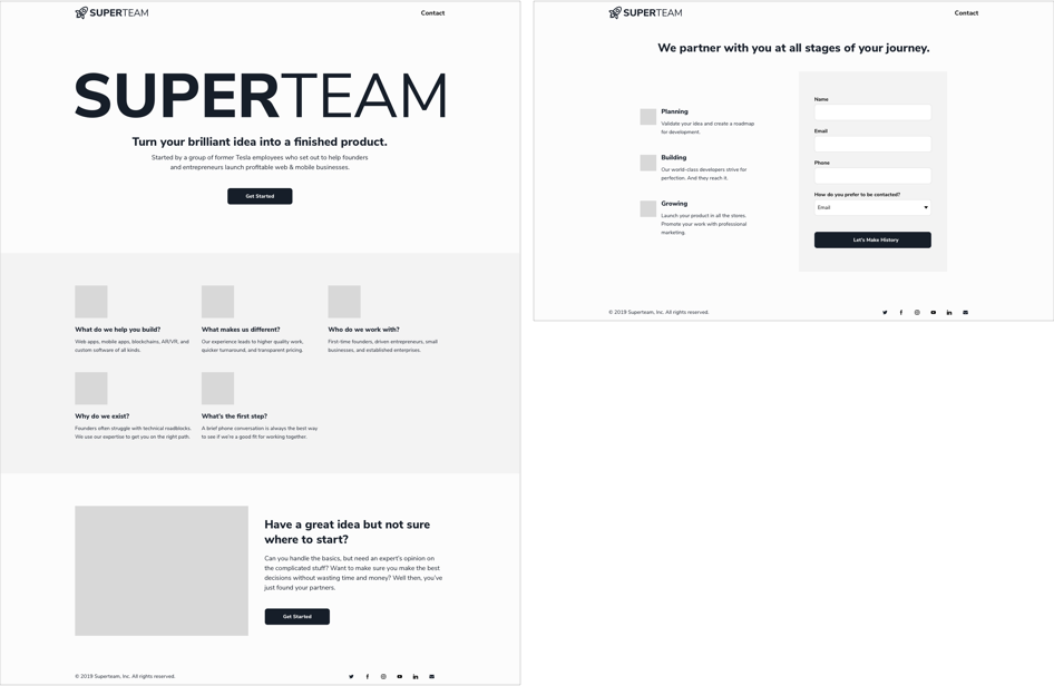
WIREFRAMES
I started with the low-fidelity wireframes. My design concept is minimal, high-contrast, and user-friendly.
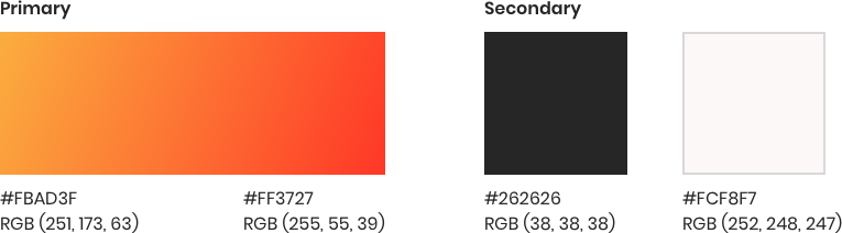
COLOR PALETTE
Our primary colors is comprised of red and orange to show Superteam's vitality and enthusiasm. Using black and white as our secondary colors to match with the new logo.
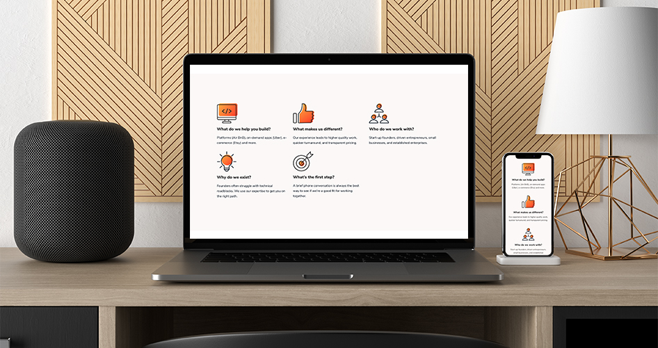
ILLUSTRATIONS
See your ideas come to life.
Illustrations are powerful for telling a story and representing our brand. The main illustration of this project is giving our clients an image of building their products with Superteam.